The key is to make sure that your core business information is captured, but at the same time ensuring that the design is kept clean, minimal and beautiful.
Minimalist website designs are quickly growing a lot of interest. The simplicity and cleanliness of the layouts have many benefits.
- Ability to load faster due to the reduced number of photos and graphics.
- Less clutter on the pages.
- Less confusion and overwhelm by website visitors.
- Better site flow for visitors; visitors know what to click/visit next therefore, more of an intuitive experience.
- Less choice offered to visitors can actually be a good thing
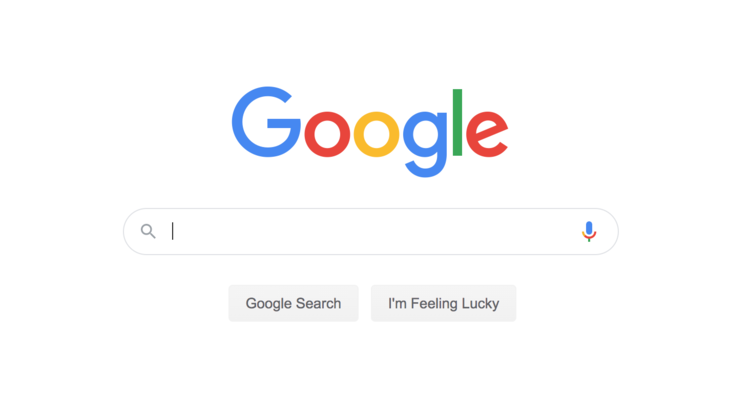
If there is one design we need to think about when it comes to an amazing user experience. Google. Ask yourself, “what are they wanting me to do here?”. The answer is “one thing, and that is to use their search engine”.
No confusion and no other choices, just a clear call to action which is in line with their business’ site goals.
LESS CLUTTER, LESS CONFUSION ….
With a minimalistic design, you’re not including any unnecessary content within a particular page, that can potentially be added somewhere else (if you decide you still want it).
Before adding content to a page, ask yourself:
- Does it really need to sit on this page?
- Do the important links stand out?
- Can it be moved to the footer of the homepage?
If the page is left cluttered, then the visitor is left confused with the sheer number of options to choose from, or images/graphics to look at.
Basically, there is no breathing space for visitors. White, or blank space, is a fantastic method within minimalist design to help achieve a better user experience.
Intuitive Experience
Whatever your business is about, the point of a minimal web layout is to ensure that your ideal client type knows where to click next in order to achieve the action that they want.
Minimal website designs do not offer the visitor too many clicks or steps in order for them to get to the desired location. Whether this is to purchase a product or get to a contact or enquiry form.
It’s all about the user experience and improving it, and that is the point of a minimal layout.
This is also why before building a minimalist site, it is important to define a clear website roadmap, going from the homepage to where you want your visitor to finish.
Minimal Designs for Every Business
You may be thinking that reducing the amount of choice for your website seems near impossible.
For example if you’re an ecommerce business, and the number of products you sell contradicts the limited choice concept. To be perfectly honest and in such cases it is not always possible to reduce the amount of choice, but there is the opportunity of conducting some user testing and research here.
This is a whole other topic to discuss, but the main questions to ask are:
- What are your user’s requirements?
- What do they need in order to help them find the right product for their needs?
- How can such requirements be translated into an intuitive website roadmap?
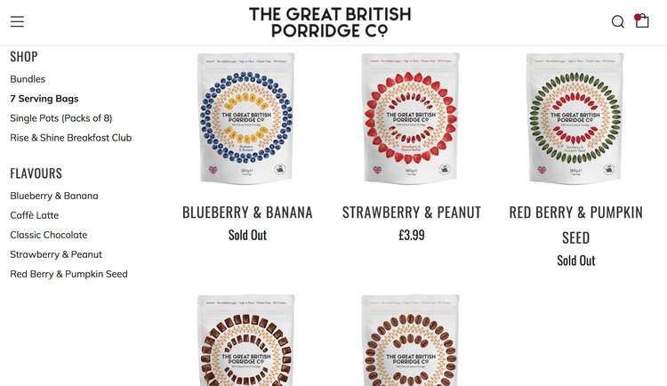
Even as an ecommerce business, you can build a beautiful and clean website. This is done by including as much blank space as possible in between content, decluttering the page to be free from irrelevant content and, keeping CTAs clear and not hidden away.
An example of this is below, where you can see that plenty of white/blank space has been left in between the products, and the page doesn’t contain any unnecessary content.
Minimal Websites & Better Sales
The take away from all of this is that with a minimal web design strategy, entrepreneurs and businesses can rely on their websites to be self-sufficient because of all of the advantages that the simpler layout brings.
- Reduced choices on a page means better focus by potential customers and consumers.
- Reduced clutter on a page means less overwhelm and confusion, so visitors stick around longer.
- Important links such as CTAs are made clear on the page, and visitors know where to go next.
- Your business’ unique niche stands out on the page, attracting your ideal clientele.
Overall a much better user experience.